Distinct | Original | Classic
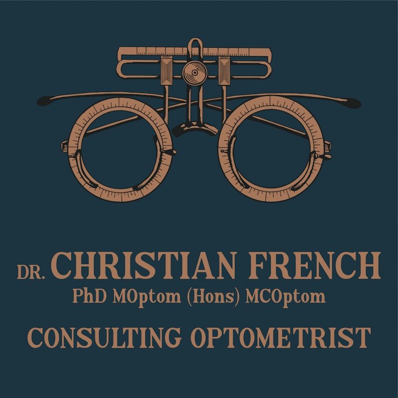
Christian got in touch late 2020 and commissioned me to design a logo to launch his new business in 2021.
With a simple brief to create an original illustration which would represent his new practice, Christian was happy for me to have free rein on a lot of the design process. After sending me a few photographs of optometry equipment, I decided that a pair of victorian trial frames would be best suited for logo artwork – glasses frames are commonly used to represent the field of optometry, but Christian wanted to ensure that his logo was individual and distinct, making the trial frames a perfect choice; instantly recognisable, yet individual.
After hand-drawing and original piece of artwork and digitally converting it, I paired it with a complimentary font style and classic colour scheme which included copper, a colour which is commonly seen in many vintage pieces of optometry equipment.
The finished product is one which both myself and Christian are really happy with.
