CLASSIC & INDIVIDUAL
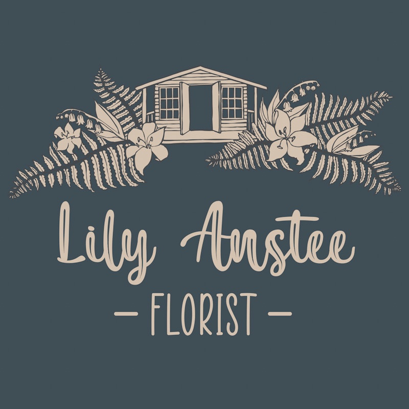
Lily contacted me near the end of 2020 and asked me to redesign the logo for her small floristry business. After making her own logo using a free app, Lily decided that she wanted something which was more individual and professional looking which would help her business stand out from other florists.
Using Lily’s cabin-style workshop as inspiration, I sketched up a few compositional designs for her to take a look at, which included her specified choice of flowers and foliage. From the designs I provided there was a clear winner, so I got to sketching up a final design which would form the logo artwork. With a natural, rustic look in mind that would compliment Lily’s beautiful work, the choice was made to create the image from a linocut print instead of a precise pen and ruler drawn image. Once the print was complete, I converted the scanned image into a vector, which was then ready for rendering with a complimentary colour palette.
After trying some traditional floristry colour palettes (lots of greens!), nothing was standing out to Lily, so she asked me to present her with some other options. Needing a colour combination which would compliment any of of Lily’s arrangements – each with a varying array of colours themselves – I presented Lily with the blue and cream option you see above, which instantly seemed to appeal.
In Lily’s own words, this logo is ‘classic and individual’, with a colour palette that is ‘a little bit brave’, differing greatly from the commonly, and often over-used green colour palettes seen in many floristry logos.


